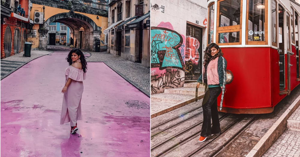
Instagram is where the junta is at these days. If you have a beautiful feed, you can capture people’s attention in no time. After all, isn’t is amazing to open the app and have beautiful pictures flood your feed? We know it is. That is why we love Palki Malhotra’s Instagram feed. Not only is it aesthetically pleasing, scrolling through the feed will make you want to travel so bad. With about 10K followers on Insta, you know she’s doing something right because we’re obsessed with her eye for detail. We decided we wanted in on the secret of how she built the feed and everything that goes on behind the scenes for those gorgeous pictures you see. Here are some tips Palki gave us that we couldn’t wait to share with you.
1. Be Present
The first thing you need to remember is that you should be passionate about creating content. Don’t do it only for money but because you genuinely love to deliver service to the people who’ll come to your feed. When it comes to shooting at different locations or looking for corners that can be Instagrammed, don’t be lazy. Invest your time and effort in it and it’ll definitely pay off.
Looking for a cute passport cover? ‘Travel On My Mind’ is Palki’s go-to passport cover!
2. Decide On A Basic Aesthetic
You may have heard it a few times but it is still an underrated tip. Choose a basic colour palette before you set off on designing your feed. This colour aesthetic will give your feed coherence and consistency and make it look more appealing to those who visit your profile. For Palki, the colours she has chosen are pink, red and white. But if you’re someone who lives in a tropical area and has access to places that have the blue-green colour palette, you can select those colours. Just make sure you pick up the most basic colours and then use variations of them.
Pro Tip: If you’re someone who plans to play with colours, just ensure that you have your 3*3 grid (ie 9 posts) with one colour scheme and then slowly transition into the next colour.
3. Use Locations To Your Advantage
Where do you love to travel the most? Which cafes do you frequent the most? Where is it that you love hanging out the most? Think about all these things and the colours you see the most there and then decide on your feed’s theme. If you’re going for a vacation and planning to take some beautiful pictures there, do your research. Every location that is Instagrammable has already been Instagrammed. All you have to do is search for the hashtags and save the locations you like. It’ll require a little bit of time but it’ll so totally be worth it in the end.
However, if you don’t have access to locations, set up a corner in your house. Put up posters, images, find little trinkets to make it perfect. You can also use that corner for all your flat lays and other images.
4. Preplan Your Outfits
Anything you see on Instagram is not a coincidence. Hours of planning go in it. So, don’t try to wing it and think you’ll figure out stuff while you’re there. Plan your outfits in advance while packing so that at least one of your chosen colours can be in the picture when you want it.
5. Visualise Before You Post
Nobody is skilled enough to post on the go and expect their feed to look spectacular. Everyone who has a pretty feed plans it way in advance to make it look like it all fits together. If you download an app like Preview, you’ll be able to put together the pictures you want in a grid and move things around and see what it looks like. This’ll really help you to visualise your feed.
6. Props Can Make Or Break Pictures
Props can totally make or break your picture. A lipstick, a trinket or a bag in your picture can add the oomph it requires. If you can’t achieve the colour scheme through your outfits or your surroundings, you can always do it through an accessory. They are the most underestimated little tricks up your sleeve.
7. Choose A Style Of Editing
Stick to, at most, 2 styles of editing. NO MORE. Switching up between filters can break the flow of your feed. Committing to a couple of filters will create a signature style for you. If your filter is dark and with shadows one day and the next there is a lot of light, you’ll lose the essence of your feed.
If you’re looking for a cute planner like this, this Stories, Notes, Dreams & Schemes Notebook from POPxo Shop is perfect for you.
POPxo is now available in six languages: English, Hindi, Tamil, Telugu, Marathi and Bangla.
AWESOME NEWS! POPxo SHOP is now Open! Get 25% off on all the super fun mugs, phone covers, cushions, laptop sleeves, and more! Use coupon code POPXOFIRST. Online shopping for women never looked better!


